This function provides the visualization of the events of the settings grouped by cohort and time window.
Usage
plot_hcru(
  summary_df,
  x_var = "time_window",
  y_var = "Cost",
  cohort_col = "cohort",
  facet_var = "care_setting",
  facet_var_n = 3,
  title = "Average total cost by domain and cohort",
  x_label = "Healthcare Setting (Domain)",
  y_label = "Average total cost",
  fill_label = "Cohort"
)
Arguments
- summary_df
Output from estimate_hcru()
- x_var
A character specifying column name to be plotted on x-axis
- y_var
A character specifying column name to be plotted on y-axis
- cohort_col
A character specifying cohort column name
- facet_var
A character specifying column name to generate faceted plots
- facet_var_n
A numeric specifying number of columns for facet output
- title
A character specifying the plot title
- x_label
A character specifying x-axis label
- y_label
A character specifying y-axis label
- fill_label
A character specifying fill legend label
Examples
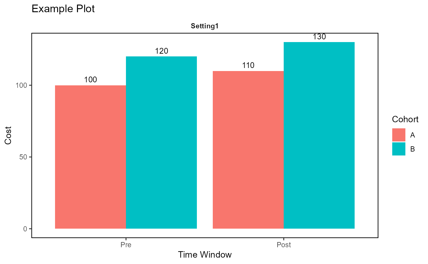
df <- data.frame(
  time_window = rep(c("Pre", "Post"), each = 2),
  cohort = rep(c("A", "B"), 2),
  care_setting = rep("Setting1", 4),
  Cost = c(100, 120, 110, 130)
)
plot_hcru(
  summary_df = df,
  x_var = "time_window",
  y_var = "Cost",
  cohort_col = "cohort",
  facet_var = "care_setting",
  facet_var_n = 1,
  title = "Example Plot",
  x_label = "Time Window",
  y_label = "Cost",
  fill_label = "Cohort"
)